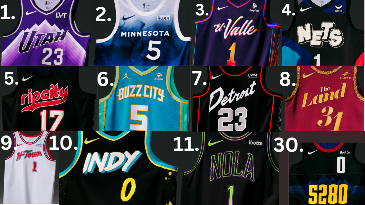
Every year, each team must produce a new City Edition jersey. Sometimes, these jerseys represent the city’s culture or bring pops of color and unique design. The jerseys are even more critical this year as they will be worn during the NBA’s first in-season tournament. They also will match the custom in-season tournament courts.
1. The Utah Jazz: I love the throwback to the Jazz’s old-school era and the pop of color. The nod to the Utah mountains behind the letters looks terrific and the fade in the color is perfect.
2. The Minnesota Timberwolves: This is unlike any Timberwolves jersey I have ever seen. It gives a very smokey effect, as well as paying homage to their nickname, “The Land of Ten Thousand Lakes.”
3. The Phoneix Suns: This jersey looks great with its highlights and gradient colors. The lettering brings awareness to Phoneix’s Mexican community by changing the original “The Valley” name.
4. The Brooklyn Nets: The Nets partnered with KLAWS (from the city) on this jersey with their famous X logo on their shorts. I like the logo and different colors used on this graffiti jersey.
5. The Portland Trail Blazers: This is a sleek design with plaid lettering and a black jersey. These look clean because they are simply only three colors.
6. The Charlotte Hornets: This jersey is a tribute to the U.S. Mint and is supported by Mr. Beast and his chocolate bars Feastables. I enjoy the stingers on the side of the Buzz City lettering and I like the golden outlines. These colors work well together and are very different from the other jerseys on this list.
7. The Detroit Pistons: Based on the Detriot Bad Boys and Chuck Daly, the Pistons, came out with a fresh jersey. The sideways logo and the multi-faceted combo of colors are great. I like the side panel mainly because it looks like skulls.
8. The Cleveland Cavaliers: Bringing back “The Land” was brilliant, and the jerseys give off a “rich” vibe. The red and gold shine here. The pattern on the neck and shoulders is very original. I hope that the Cavs continue to move in this same sort of direction for their future jerseys.
9. The Houston Rockets: The Rockets went with a classic; this jersey reminds me of Hakeem Olajuwon and Clyde Drexler. The H-Town is just right and makes the jersey feel very USA. The short side logo with an astronaut in space is so cool.
10. The Indian Pacers: Meant to show off the city’s neon colors and local street art, The Pacers went with a highlighter look, and I like it. Although it has received some negative feedback, I think these are fire and have many bright colors that contrast positively.
11. The New Orleans Pelicans: The Pelicans made a neon Vodoo jersey that has highlights of green on black. This jersey feels very New Orleans and the Nola lettering looks great.
My Least Favorite Jersey
30. The Denver Nuggets: I don’t know what last year’s NBA Champions were thinking with these jerseys. These do not look good and have two numbers on the jersey. The 5280 number is supposed to honor the city nickname “the Mile High City,” but it seems like it was just slapped on there.

